
프론트킷
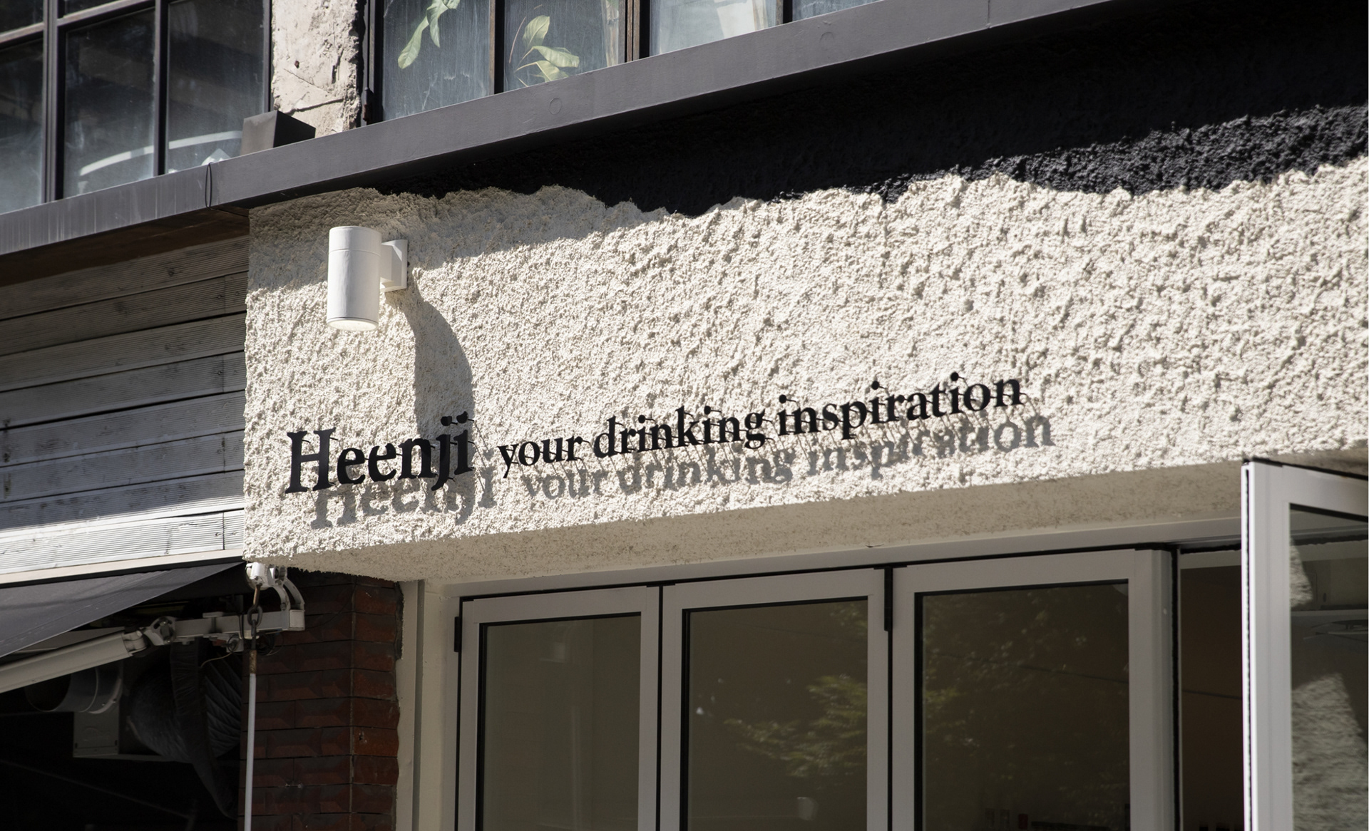
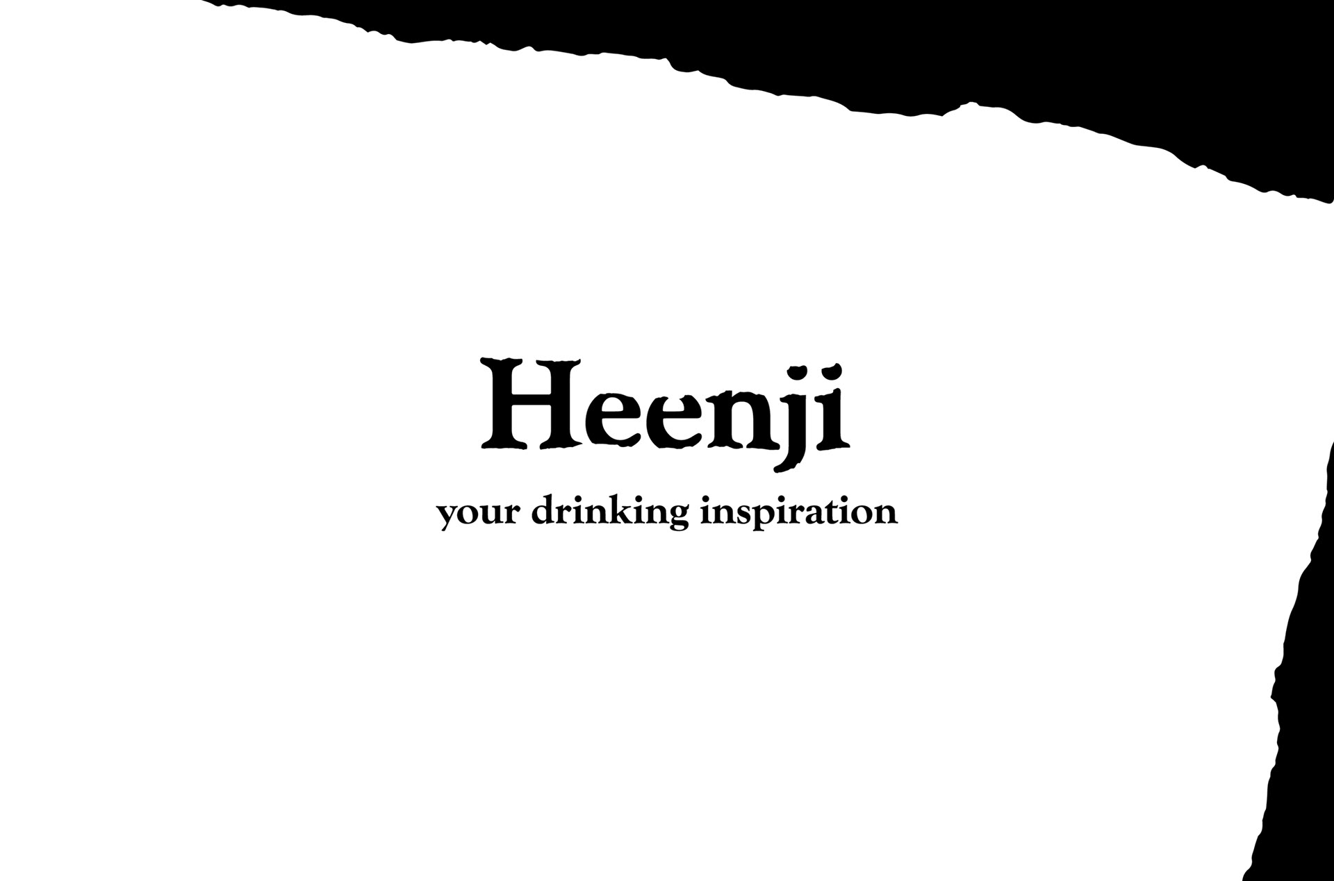
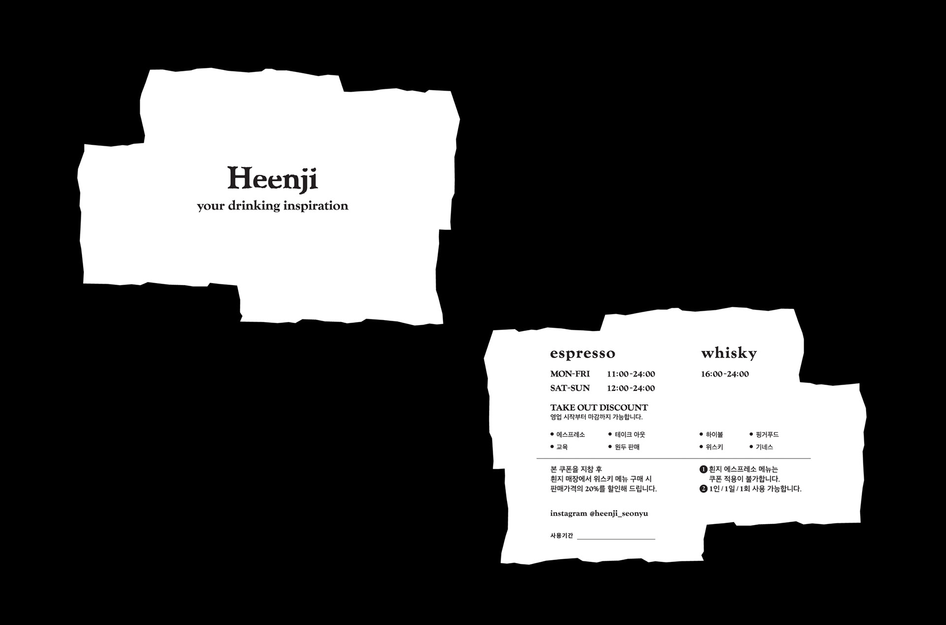
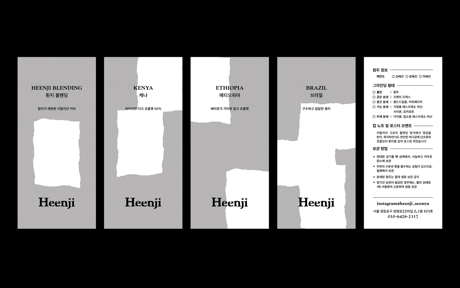
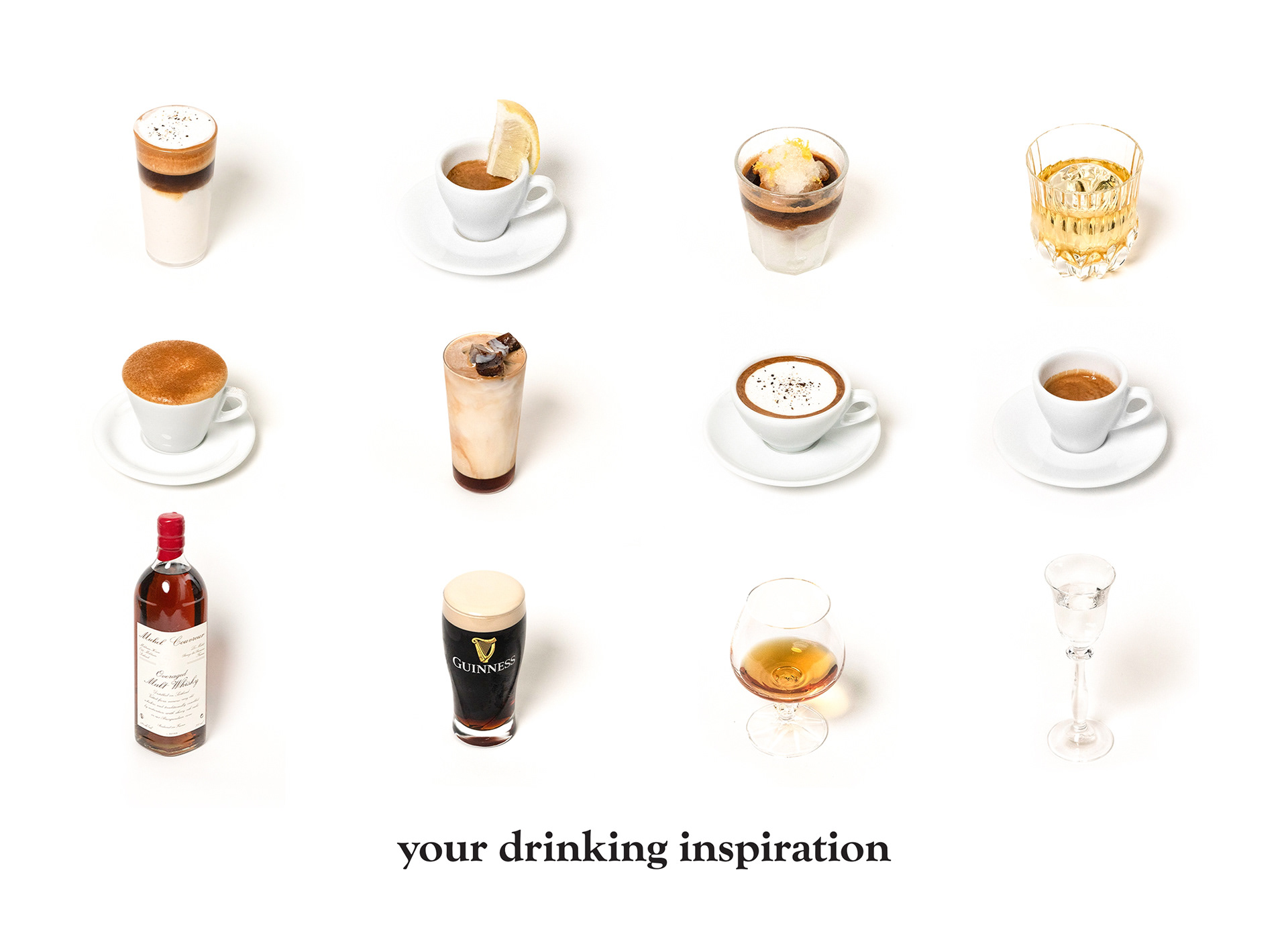
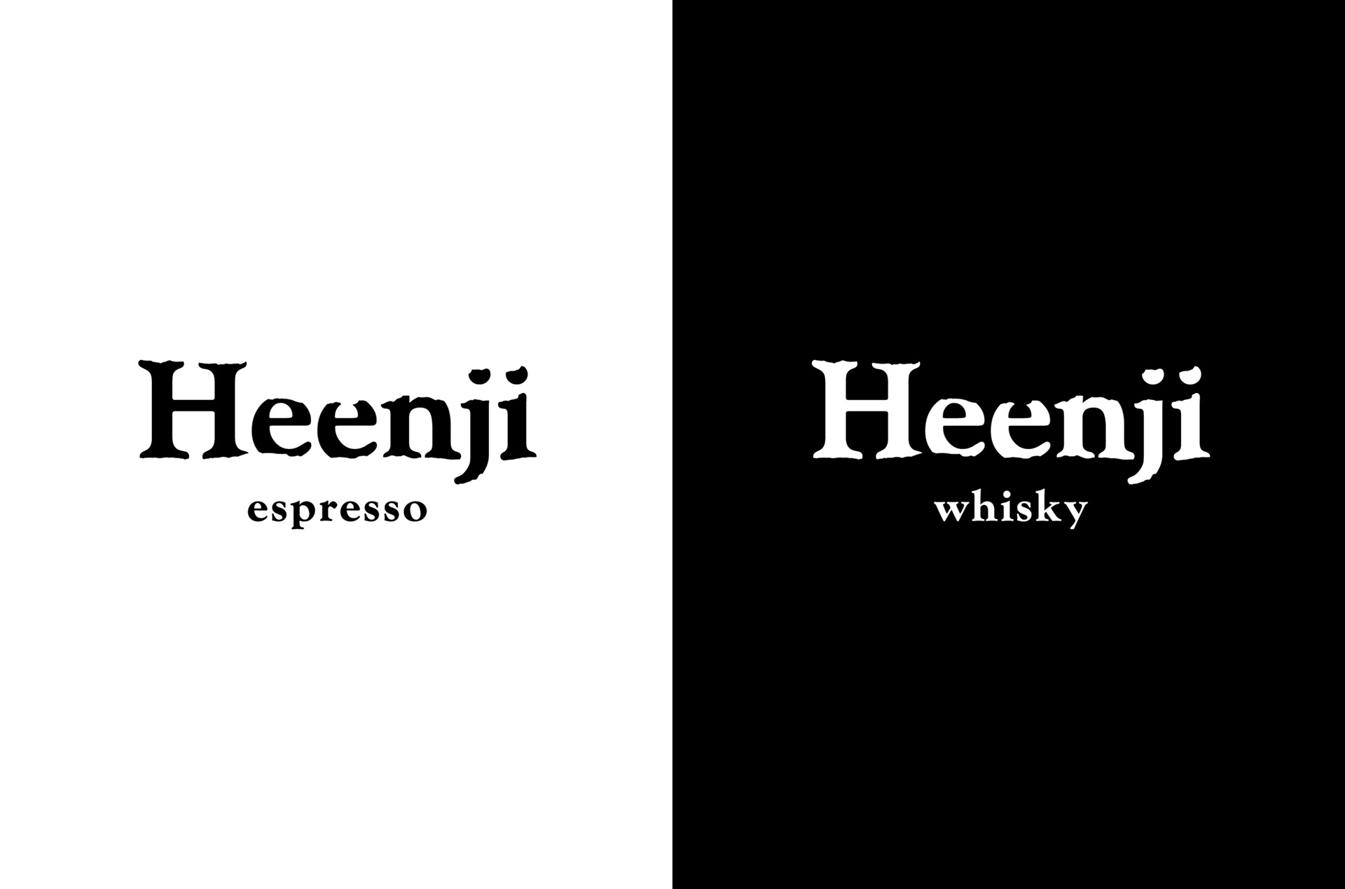
Heenji
흰지
흰지
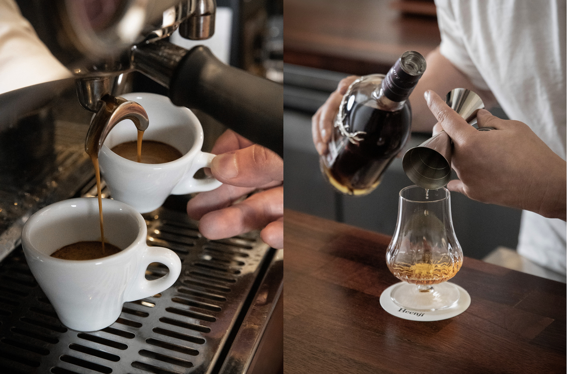
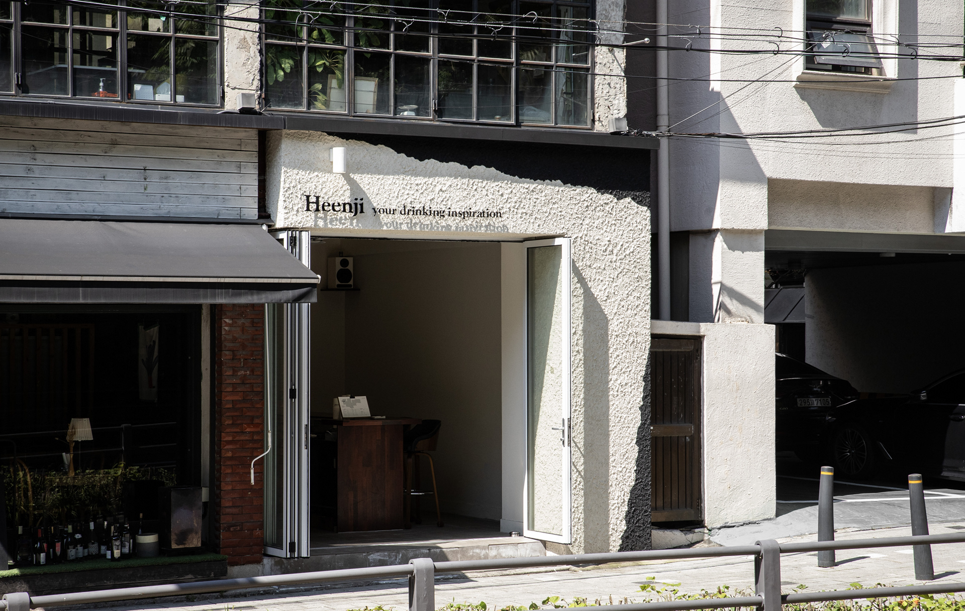
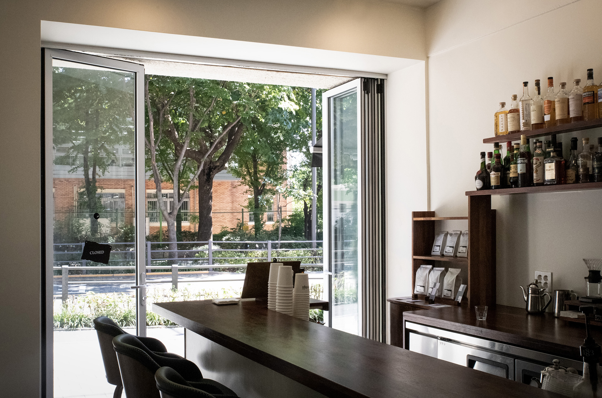
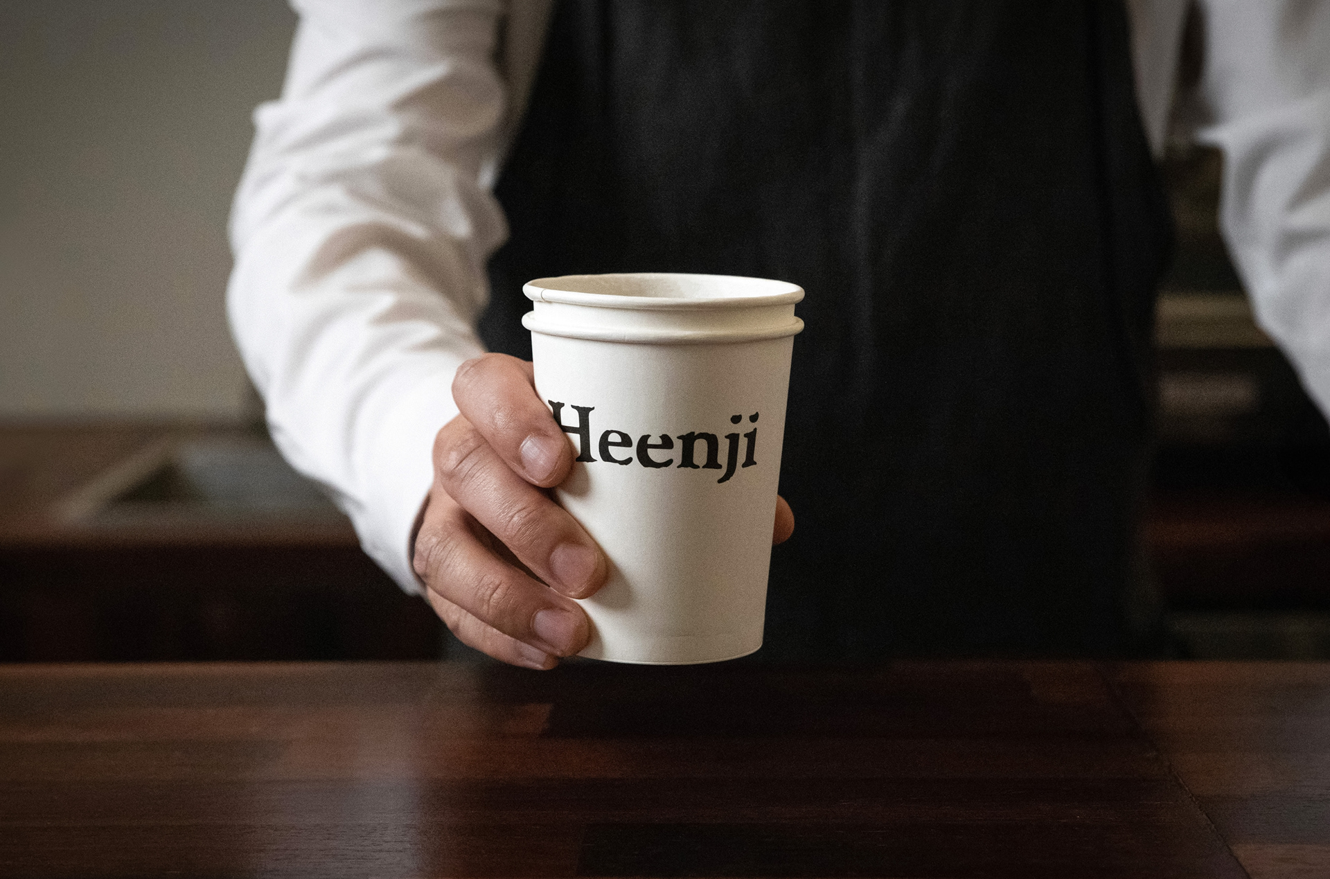
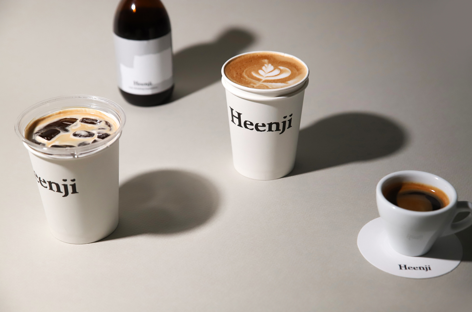
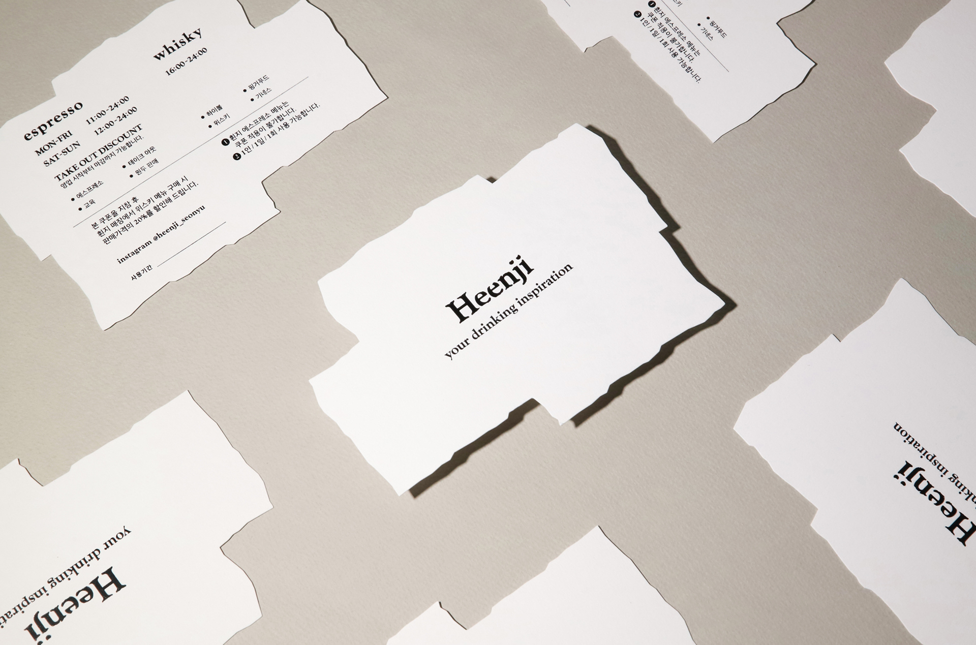
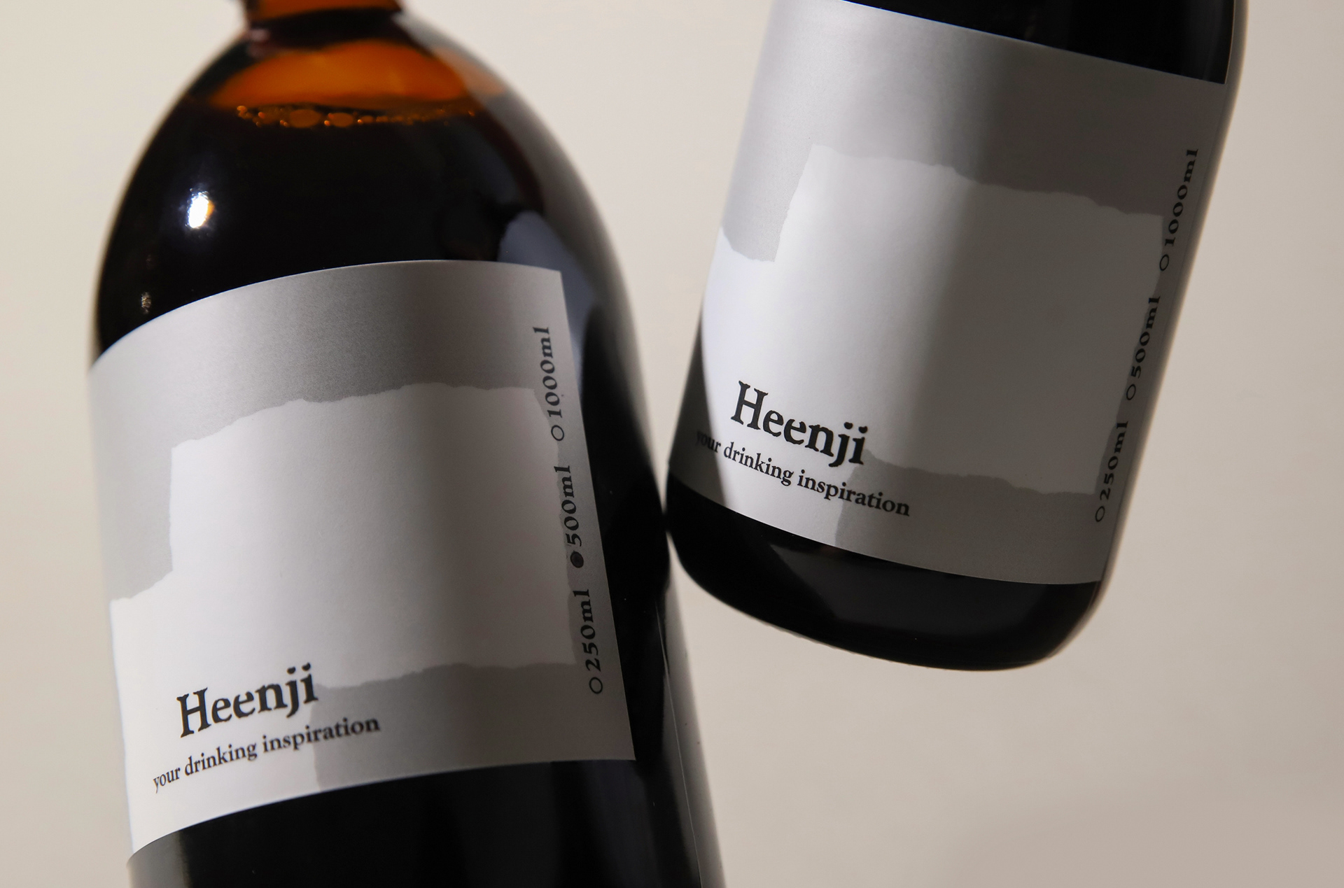
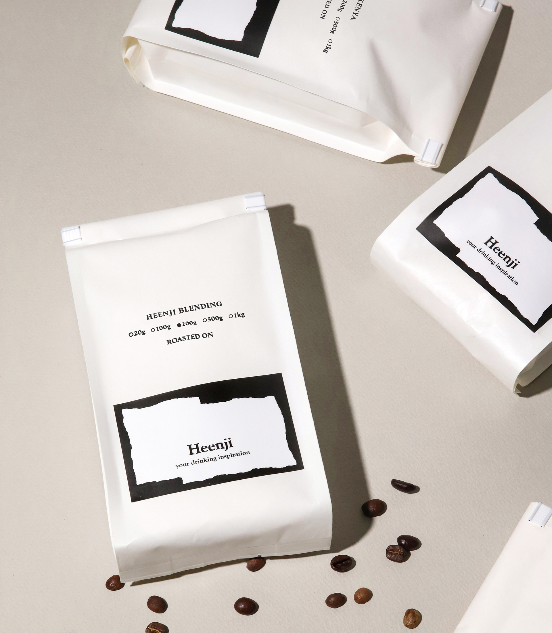
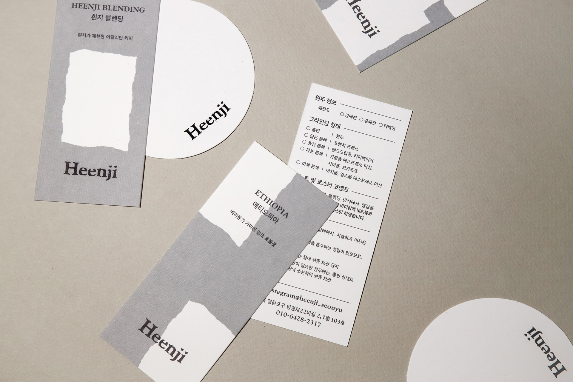
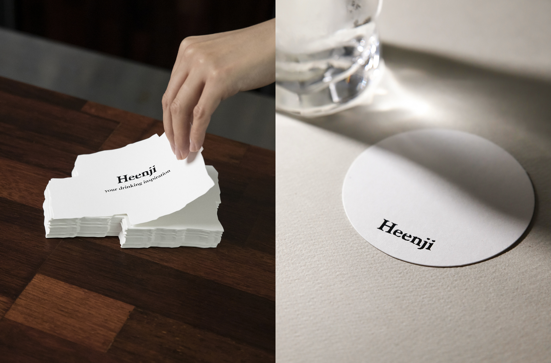
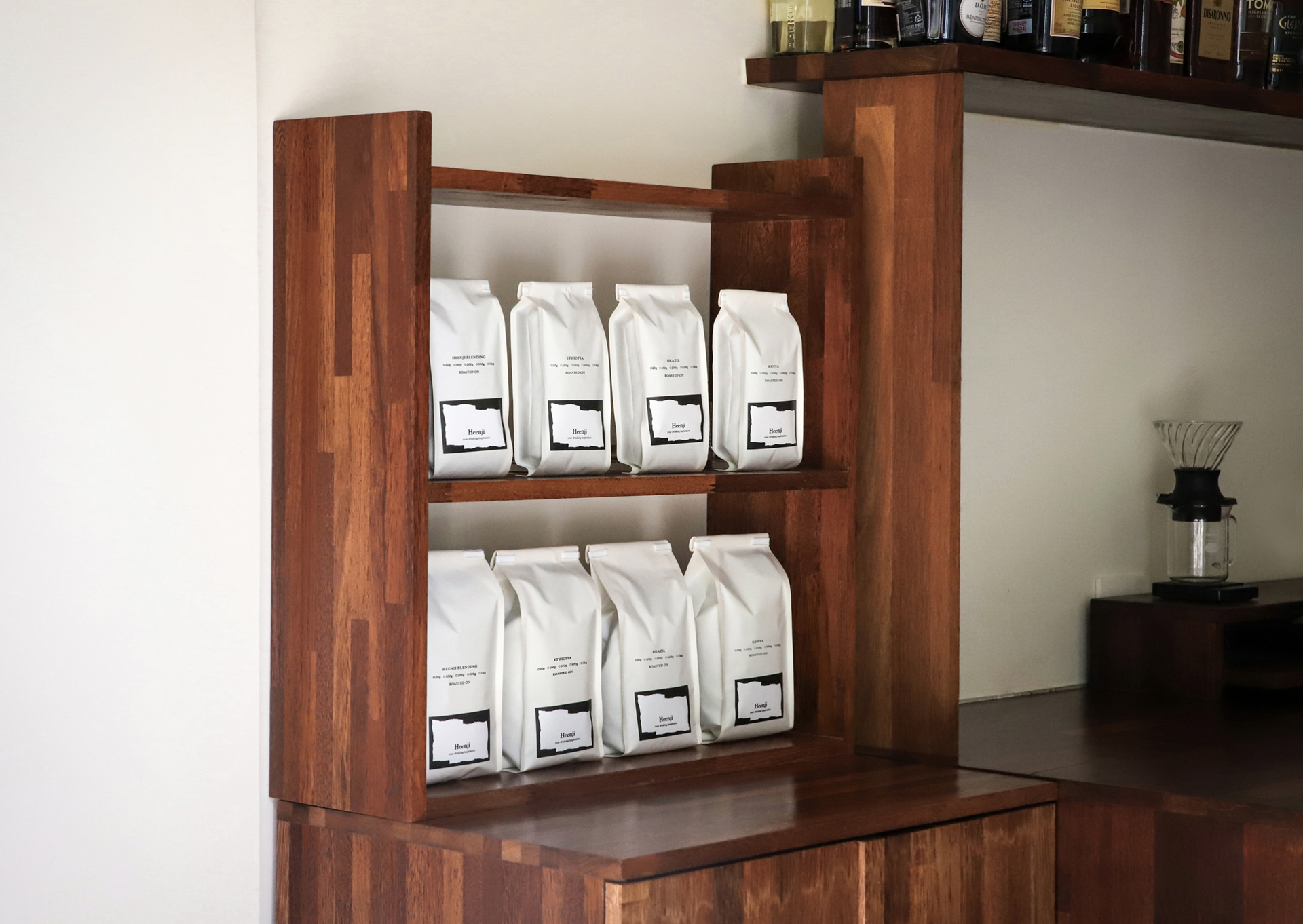
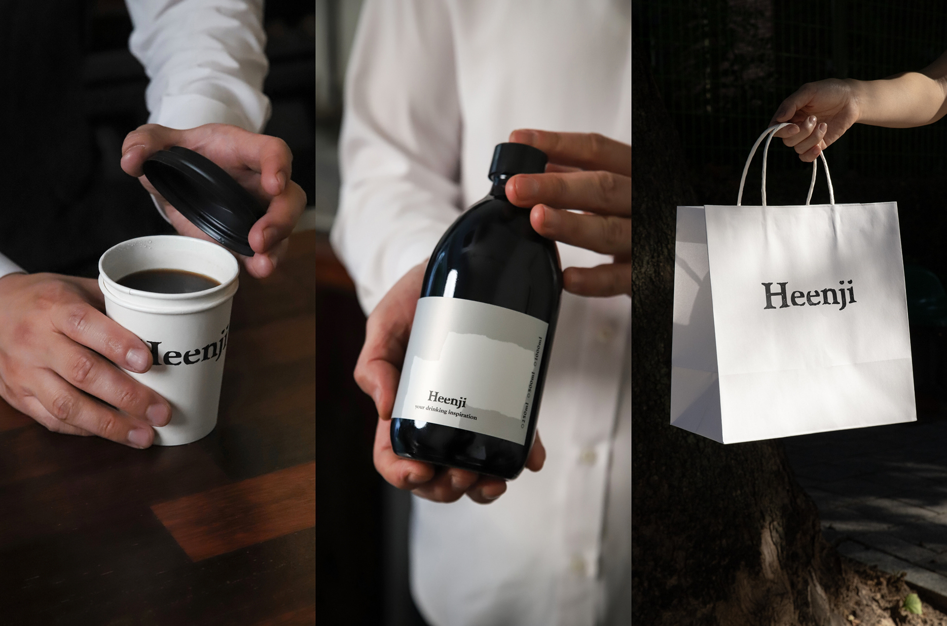
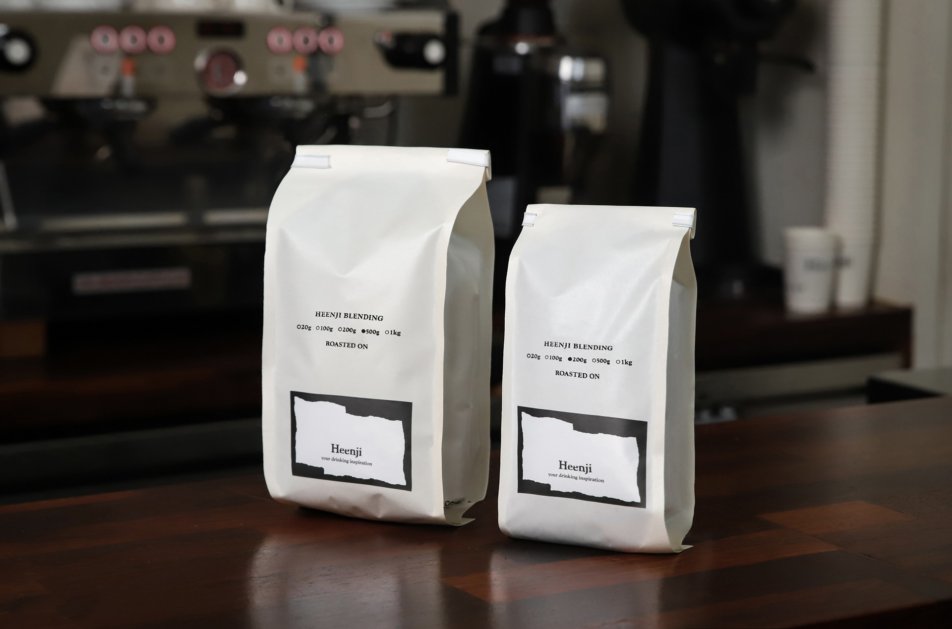
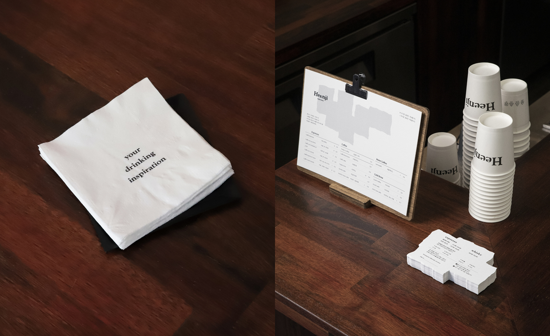
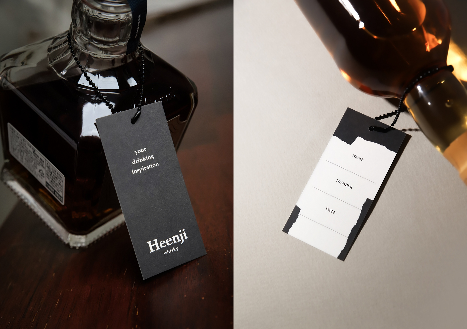
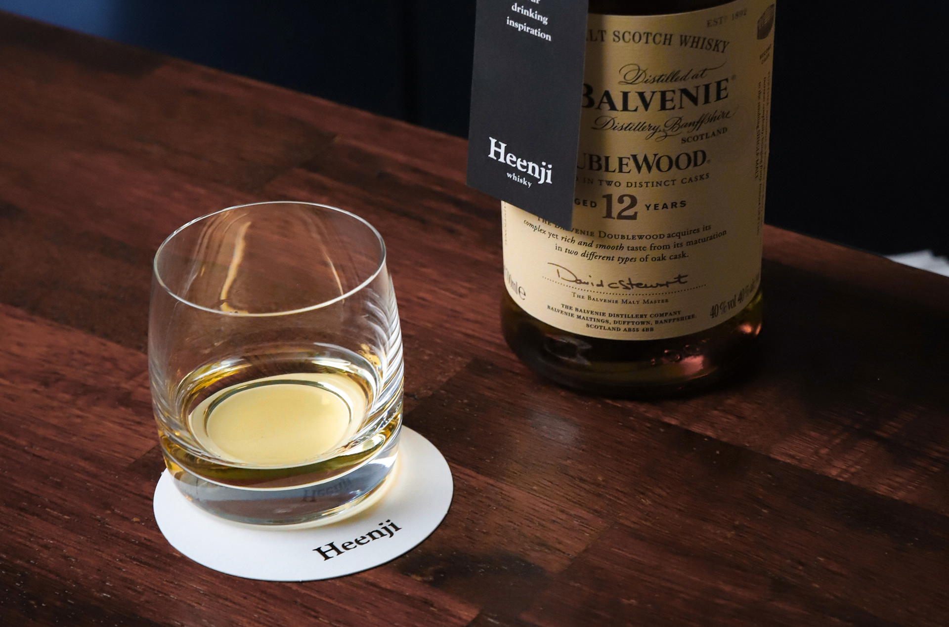
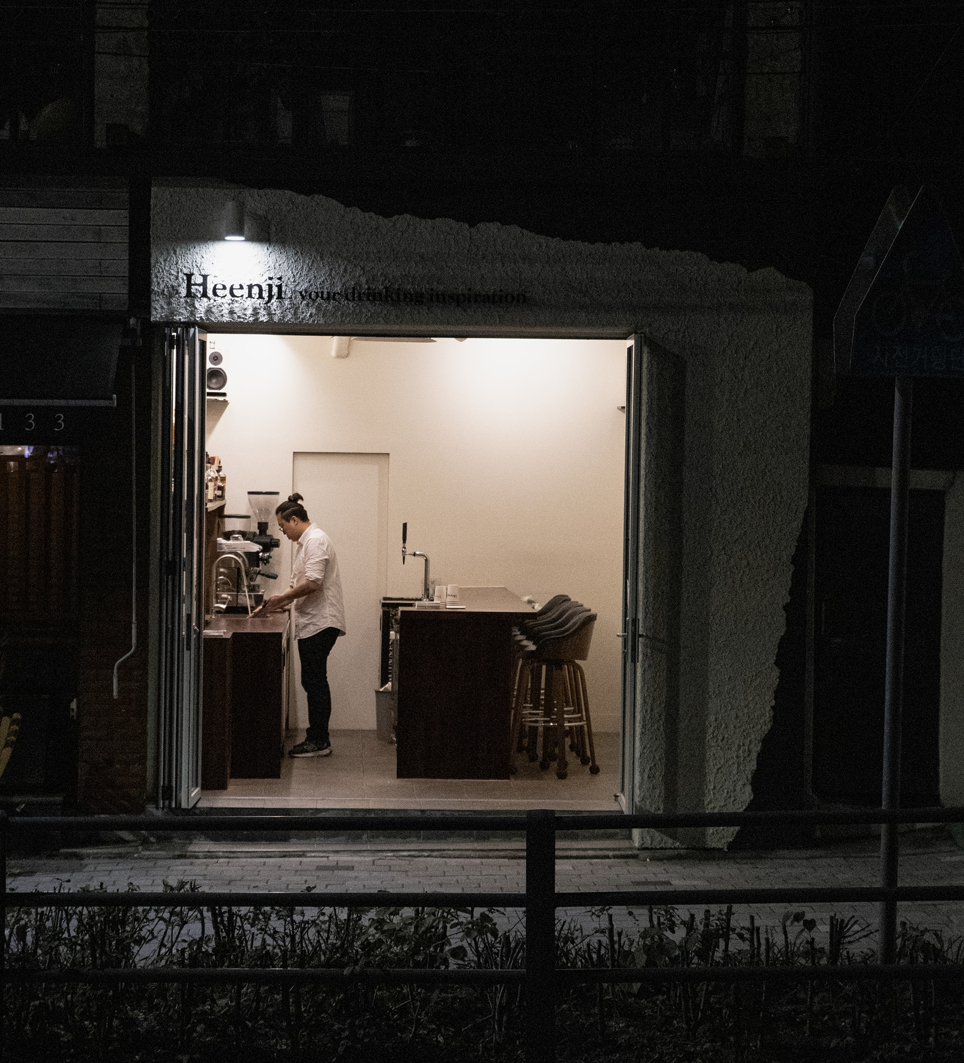
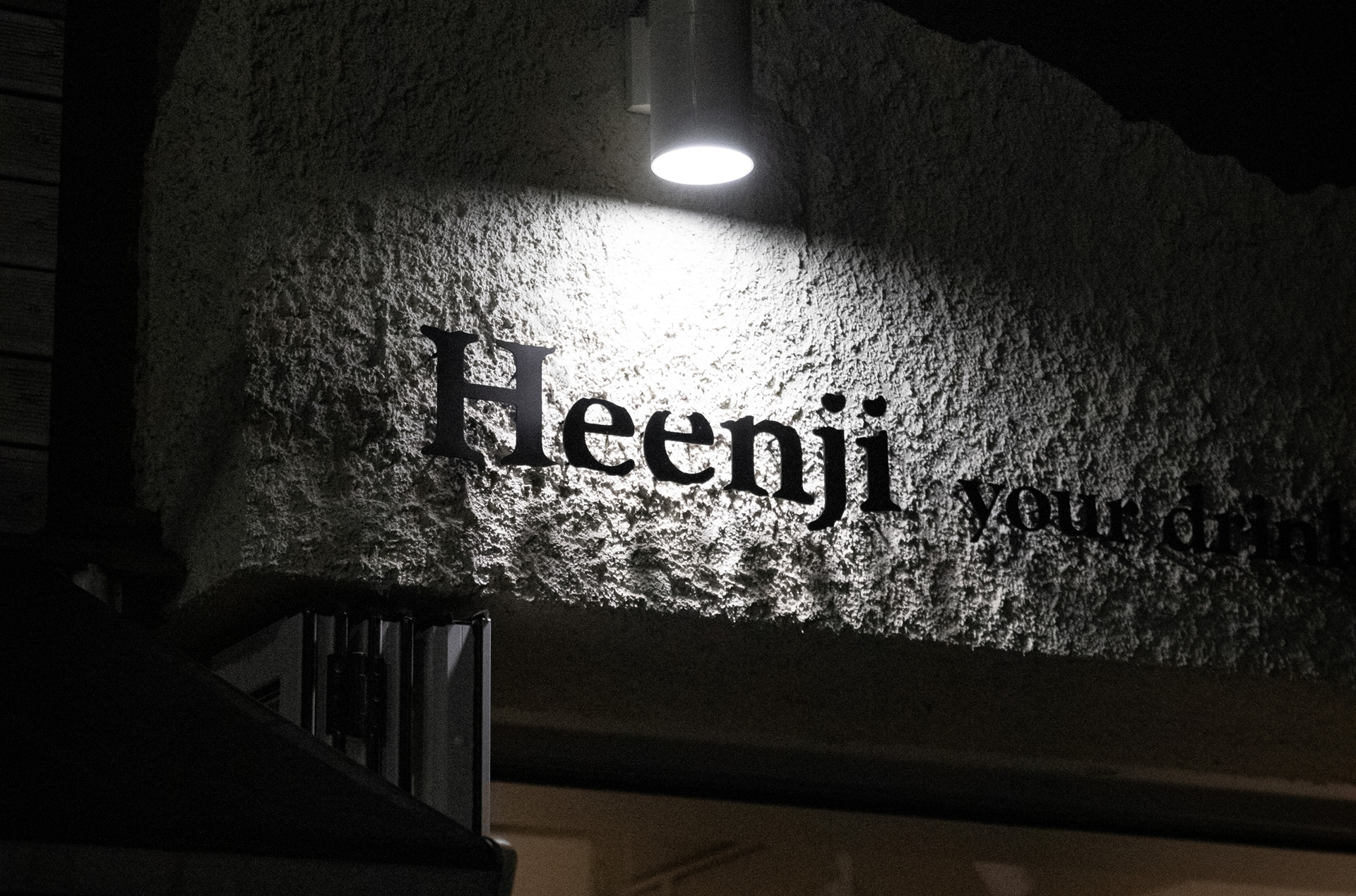
Heenji is an ‘espresso bar’ during the day and a ‘whiskey bar’ at night. To symbolize its flexible identity, FRONT KIT developed a naming and verbal identity meaning 'white paper,' and created a logo and graphic design inspired by the tearing texture of paper to implement it on the products and store VMD.

Client: @heenji_seonyu
Agency: FRONT KIT
Creative Direction: Min Ah Hong
Art Direction & Design: Yun Woo Shin
Brand Story & Copywriting: Min Gi Hong
Naming: Hyeok Kim
Design: Hyeok Kim, Ga Bin Kim
Photo: Ga Bin Kim
Agency: FRONT KIT
Creative Direction: Min Ah Hong
Art Direction & Design: Yun Woo Shin
Brand Story & Copywriting: Min Gi Hong
Naming: Hyeok Kim
Design: Hyeok Kim, Ga Bin Kim
Photo: Ga Bin Kim